Visual Communication: Typography and Imagery
by charlottewootten
This week I was given my visual communications brief for which I had to produce two A3 final outcomes which related to the title ‘Systems’. After seeing Scott King’s work, who used simple imagery to create a clear narrative about the seating arrangements in concerts, I was inspired to base my own work on the system of concerts and how someone might perceive the relationship between musicians and their fans.
To begin my project I first experimented with typography. I based my typography on the theme of music and experimented with different compositions and colours. My favourite experiment was ‘YOU ARE THE CROWD’ which was inspired by Scott King. I made the white text stand out from the black background which turns into black dots which represent people. I also thought about the composition of this piece very carefully and by placing the text in the top left corner allows your eyes to travel along the dots of people into the negative space which I think is visually interesting. Furthermore, I really like the contrast between the white and black shades as I think this adds to the simplicity of the design. Using the pronoun ‘you’ also allows the design to speak directly to the audience allowing the piece to capture their attention. This design would be one that I would later come back to when it came to producing my final outcome.
After experimenting with typography, I then experimented with imagery. To help inspire me I used fashion magazines to experiment with cutting out collages. I found this task really helpfull as this allowed me to think about different shapes and colours.
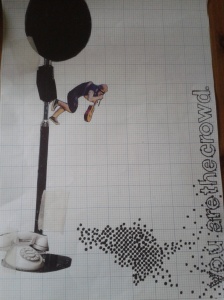
Finally, I designed my final outcomes. For both of these I used a mixture of my own imagery and found imagery which formed the base of my visuals. In my first final outcome, I used grided paper for the background and portrayed a musician looking down onto the audience which I had drawn as small dots. In my collage I used found imagery of a microphone stand and a telephone which I included to portray the message of how fans wish to communicate with their idols. The small dots connected with the text which says ‘You are the crowd’, the text I initially experimented with in my first attempt of typograhy. I think that the vertical lines in the image from the text and also the microphone stand create a balanced composition as they are placed either side of the sheet. Also, I intentionally placed the text so that the audience reads upwards, leading their eye to the musician which is above the crowd. I think that this layout provokes the thought of the social status of musicians and fans; the musician is pictured looking down up on their fans who look up to them. Furthermore, all of the dots in the audience are the same which connotes that they are all equal and that it doesn’t matter where abouts in the crowd they are; they have all come to see their idol.
I then produced my second visual. To produce the basis of my collage I used found imagery as well as a photo of my own of a concert screen. I constructed a 3D collage with my imagery and then photographed this before using Photoshop to deliberatly make the photographs appear slightly fuzzy by adjusting the levels of black, white and grey tones. Again I used the same text however I think that this has a harsher feeling because of the use of capital letters and block colours. Unlike my first collage where the text is connected to the imagery, I placed the text right above my imagery leaving some negative space between the text and the pictures. I think that this negative space gives the viewer time to read the text first before viewing the imagery which completes the narrative. To finish off my collage, I used Photoshop to colour in the text. Most of my text is black which makes it stand out and complements the picture of the concert, however I coloured the word ‘ARE’ red so that it connected with the red in the imagery. This red colour makes the text really stand out and along with the pronoun ‘You’, it speaks directly to the viewer. Along with the imagery of sheep which act as the crowd, I also think that this could portray a social status, of the fact that everyone who goes to the concert are all equal and are all followers of the band.
I think that both of my outcomes were successful in portraying the system of musicians and their fans or followers. Although I am happy with my final outcomes, I think that I would continue to experiment with the text I used. For example, I would try and make the text in my first outcome out of dots to make the text appear more flowing. Secondly, In my next outcome I would experiment with lower case text as I think that this text seems slightly angry and with the pronoun ‘you’ it could be interpreted as almost shouting at the audience.

