Charlotte Wootten: fashion and textiles

Art and design, research, inspiration and development

Dresscodes for Postcodes: Final Fashion Promotion Shoot

After completing research in Mayfair, my team mate and I wanted to recreate a smart casual look which would be available for an audience outside of London. This was to be inspired by the tailored looks, however we made our style look more wearable and casual with the addition of trainers, perhaps hinting to the sports trend.

DSC_0714_retouched

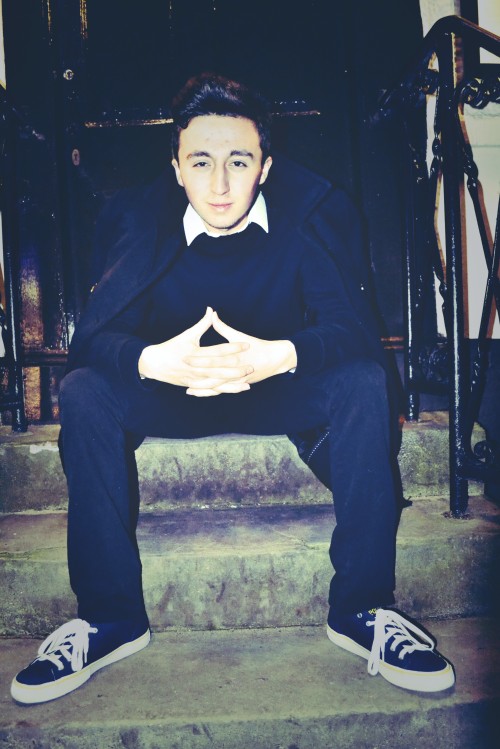
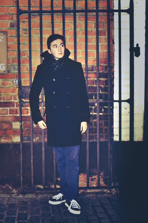
Look One

Firstly, we were inspired by the dark jeans with a tailored coat for look one. We also found a lot of people in London accessorized with scarves, so we added a casual, black and white checked scarf under the upturned collar which added more layers and textures to the look. In addition, adjusting a coat by simply upturning a collar adds definition to a style without having to add more accessories. Navy and white trainers create a sporty vibe but also makes this look very wearable whilst being smart.

DSC_0795_retouched

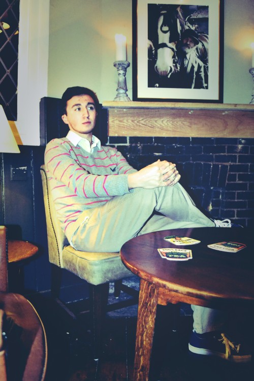
Look Two

For our next look, we were influenced by the neutral colour palette with a hint of bright colour. Chinos are worn to add comfort with a smart top and a crisp white collar. The pink stripes of our model’s top add a hint of colour which break up the neutral tones. This was inspired by the pink chinos teamed with a neutral coat and collared shirt in London. I think that this look can be worn for comfort as well as smart occasions as the colour palette is not over the top.

DSC_0786edit_retouchedLook Three

For this final look we were influenced by the layered textures and we wanted to create a relaxed, smart look. We’ve used a monochrome tonal palette and have started the look with a crisp white shirt. This is made comfortable and practical with a lightweight, wool jumper over the top. Black denim trousers ,which are a wardrobe staple, are an understated addition to this look with sports luxe trainers completing the relaxed style. Finally, a tailored jacket is worn over the shoulders adding yet another texture. Wearing the coat this way also looks effortless and stylish; it is an easy way of updating an outfit.

Overall, I think that we have achieved a very wearable smart/casual look which would not look out of place in Mayfair as well as areas outside of London. Our influences from the definitive style in Mayfair can be depicted from the smart tailoring, however our main focus was to make this an easy, everyday style which felt comfortable whilst looking smart.
Dresscodes for Postcodes : Primary Research

The brief for this project was to gain knowledge of the styles of the public in an area in London and then use our findings to create our own fashion promotion edit. My team mate and I decided to visit the postcode W1S (Mayfair), as we liked the traditional architecture combined with high end designers stores.

This slideshow requires JavaScript.


It was clear from seeing some of the high end store’s shop windows that rich, jewel like colour palettes combined with neutral tones and various textures such as velvet and corduroy were very on trend. After looking around and getting more of an understanding of the current trends in this area of London, we focused on real people with their own styles.

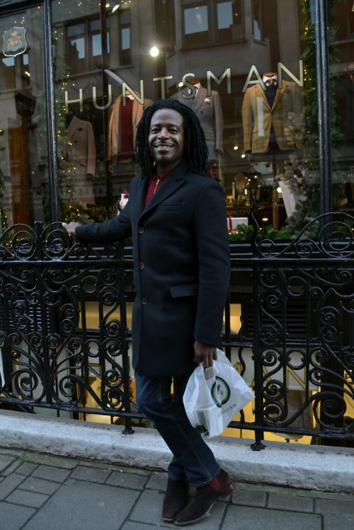
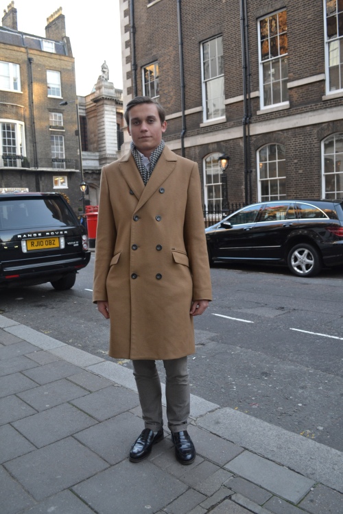
DSC_0672 retouch    This was the first person we photographed on Savile Row. My team mate and I really liked the rich colours of his outfit, starting with his burgundy, corduroy shirt with gold trims. The dark indigo jeans and suede boots created a smart/casual vibe to this outfit whilst the buttoned black jacket make first appearances seem very tailored.

DSC_0675edit

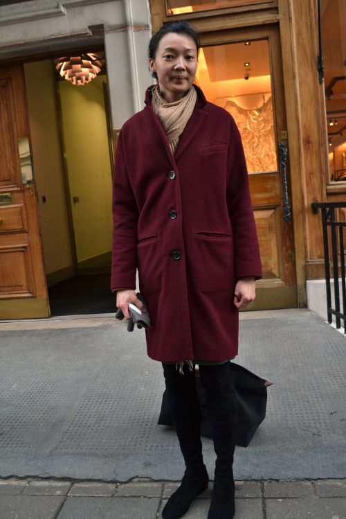
We also photographed this woman on Savile Row. Again she was wearing a rich coloured, smart coat which was definitely the statement piece of this look. The neutral scarf underneath creates an effortless look which still looks smart and casual. Then to finish the look are understated black boots which don’t distract from the berry coat.

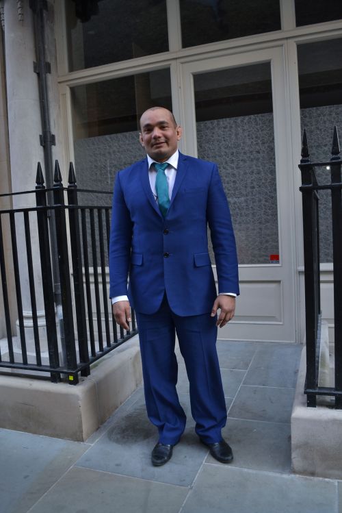
DSC_0676editWe soon found out that this was actually a uniform but we still loved the style nonetheless. Throughout the day we’d noticed that a neutral colour palette with a rich coloured accent piece was a very popular style, so to see this bright colour which was broken up by crisp white was a fresh change. I think that by adding another colour from the same tonal range makes the blue suit even more eye-catching.

DSC_0681Another photograph taken down Savile Row. I think that this gentleman’s style has been refined and is effortless. The different layers of neutral tones from the white shirt which is casually unbuttoned at the top to the checked scarf all work together perfectly to create a very clean look. The smart patent loafers finish this look and work in harmony with the other components.

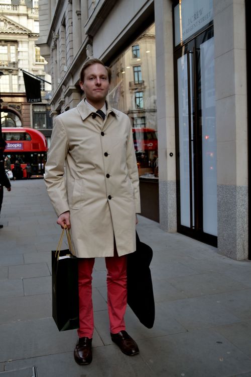
DSC_0685editAnother smart casual look with a twist. Although neutral tones and a crisp shirt are obviously favoured in this look, red chinos break up the colour palette. A simple tie is also worn underneath which may make the look seem quite tailored and smart, however the chinos bring a casual twist. The smart shoes finish this look.

I felt that it was interesting to learn how many people have similar styles although all being from different ethnic backgrounds. Furthermore, I was expecting a wider variety of trends but in Mayfair in particular the smart, tailored look is very popular and I feel may be influenced by the surroundings such as Savile Row. From completing this primary research, my team mate and I feel that we can confidently style our own shoot inspired by the smart, tailored looks we found in Mayfair. However, we want to bring a twist to this trend and make the smart look even more wearable to a younger audience and to people who live outside of London or Mayfair.

Visual Communication: Typography and Imagery

This slideshow requires JavaScript.

This week I was given my visual communications brief for which I had to produce two A3 final outcomes which related to the title ‘Systems’. After seeing Scott King’s work, who used simple imagery to create a clear narrative about the seating arrangements in concerts, I was inspired to base my own work on the system of concerts and how someone might perceive the relationship between musicians and their fans.

Scott King, 1980

To begin my project I first experimented with typography. I based my typography on the theme of music and experimented with different compositions and colours. My favourite experiment was ‘YOU ARE THE CROWD’ which was inspired by Scott King. I made the white text stand out from the black background which turns into black dots which represent people. I also thought about the composition of this piece very carefully and by placing the text in the top left corner allows your eyes to travel along the dots of people into the negative space which I think is visually interesting. Furthermore, I really like the contrast between the white and black shades as I think this adds to the simplicity of the design. Using the pronoun ‘you’ also allows the design to speak directly to the audience allowing the piece to capture their attention. This design would be one that I would later come back to when it came to producing my final outcome.

After experimenting with typography, I then experimented with imagery. To help inspire me I used fashion magazines to experiment with cutting out collages. I found this task really helpfull as this allowed me to think about different shapes and colours.

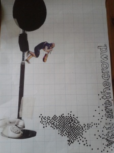
Finally, I designed my final outcomes. For both of these I used a mixture of my own imagery and found imagery which formed the base of my visuals. In my first final outcome, I used grided paper for the background and portrayed a musician looking down onto the audience which I had drawn as small dots. In my collage I used found imagery of a microphone stand and a telephone which I included to portray the message of how fans wish to communicate with their idols. The small dots connected with the text which says ‘You are the crowd’, the text I initially experimented with in my first attempt of typograhy. I think that the vertical lines in the image from the text and also the microphone stand create a balanced composition as they are placed either side of the sheet. Also, I intentionally placed the text so that the audience reads upwards, leading their eye to the musician which is above the crowd. I think that this layout provokes the thought of the social status of musicians and fans; the musician is pictured looking down up on their fans who look up to them. Furthermore, all of the dots in the audience are the same which connotes that they are all equal and that it doesn’t matter where abouts in the crowd they are; they have all come to see their idol.


My first A3 outcome for visual communications.

My first A3 outcome for visual communications.

I then produced my second visual. To produce the basis of my collage I used found imagery as well as a photo of my own of a concert screen. I constructed a 3D collage with my imagery and then photographed this before using Photoshop to deliberatly make the photographs appear slightly fuzzy by adjusting the levels of black, white and grey tones.  Again I used the same text however I think that this has a harsher feeling because of the use of capital letters and block colours. Unlike my first collage where the text is connected to the imagery, I placed the text right above my imagery leaving some negative space between the text and the pictures. I think that this negative space gives the viewer time to read the text first before viewing the imagery which completes the narrative. To finish off my collage, I used Photoshop to colour in the text. Most of my text is black which makes it stand out and complements the picture of the concert, however I coloured the word ‘ARE’ red so that it connected with the red in the imagery. This red colour makes the text really stand out and along with the pronoun ‘You’, it speaks directly to the viewer. Along with the imagery of sheep which act as the crowd, I also think that this could portray a social status, of the fact that everyone who goes to the concert are all equal and are all followers of the band.

2nd Final Outcome

I think that both of my outcomes were successful in portraying the system of musicians and their fans or followers. Although I am happy with my final outcomes, I think that I would continue to experiment with the text I used. For example, I would try and make the text in my first outcome out of dots to make the text appear more flowing. Secondly, In my next outcome I would experiment with lower case text as I think that this text seems slightly angry and with the pronoun ‘you’ it could be interpreted as almost shouting at the audience.

Fashion: Gareth Pugh

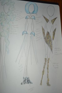
The last design on the right shows my inspiration from the city.

The last design on the right shows my inspiration from the city.

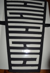
My finished design with influence from Gareth Pugh and city lights and avenues.

My finished design with influence from Gareth Pugh and city lights and avenues.

Pugh’s Spring/Summer 2012 collection

This week I designed a body adornment which would help the body adapt to a futuristic environment. I was firstly inspired by a bird’s eye view of a city, with the lights and the geometric avenues. After drawing some designs, I wanted to have a clearer idea of how to construct my designs into a real piece, so I looked at Gareth Pugh’s work.

Pugh’s striking designs are also very simplistic, with geometric lines and one shade of colour (either black or white) which allows the design to really stand out from the model’s body. I think that the use of monochromatic colours emphasises the perfect simplicity of the shapes and the sharp edges adjusts the shape of the human form and lengthens the torso and arms.

I also admire the styling of Pugh’s catwalk show. The model’s hair is slicked back so no attention is taken away from the design and the makeup is also very strong and geometric, complementing the outfit perfectly.

My finished design was made from a single sheet of black card with acetate on the back to make the piece more sturdy. I decided to keep the design simplistic by using one shade of black and using a minimum amount of varied materials. I also kept all of the lines the same width to make sure that the design was striking like Pugh’s geometric designs. In future I think that I could experiment with other materials such as foam which would be flexible and be able to mould to the body.

Moving Image

This slideshow requires JavaScript.

This week on the foundation course, we were given the brief for moving image. The task was to create a stop motion animation which would portray the morphing of various objects. This would become my first stop motion animation so I found it really interesting to learn some new skills.

Firstly, we had to draw a simplified version of an object we had brought in. Mine was a Russian doll, which I chose because I thought that being able to transform the Russian doll could allow various possibilities to animate the object. This first drawing would become the first frame in my animation.

Then we had to trace the first drawing from the person to the right of us. This would become the last frame of my animation and would show the final transformation of my object’s morphing process. Also, this would allow a variety of smaller animations to come together to create a longer animation of various objects morphing into different objects.

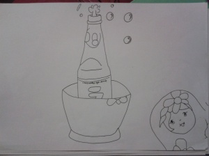
The mid-point in my animation, shows the combination of two objects during the morphing process.

The mid-point in my animation, shows the combination of two objects during the morphing process.

Next, I had to create a mid-point. This would be the frame right in the middle of my first and last frame and would show the combination of both objects before my Russian doll fully transformed into the bottle.

To carry on with my animation, I used a method called ‘in-betweening’. This means that you continue to draw frames in between frame 1 and the mid-point, then in between the mid-point and the last frame and so forth. This allows you to add in more frames with ease and means that you’ll be able to always have an ending to the animation, even if there aren’t the desired amount of frames.

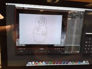
I gradually continued to add in frames before I had a total of 25. These were then used to make an animation using Dragonframe software. This worked by taking a photo of each frame and then using the Dragonframe software to adjust the times of each frame and turn them into an animation. Each frame was 1/12th of a second, so they were very fast.

Dragon frame software

Dragon frame software

After everyone’s animation had been transformed onto the Dragon frame software, they were all connected to produce a longer animation.

I was really impressed with how the final animation turned out. Everyone’s contributions were so diverse and random which all complemented each other. To improve I would really like to experiment with colour and also add a soundtrack which would complement the unexpected and weird nature of the animation.

Fine Art: Construction

This week I was given my Fine Art brief and we were given the starting point ‘Construction’. Before having initial ideas, I decided to research the art movement Constructivism, as the constructivists created a lot of 3D sculptures.

Aleksandr Rodchenko. Spatial Construction no. 12. c. 1920

Aleksandr Rodchenko. Spatial Construction no. 12. c. 1920

http://www.moma.org/collection/browse_results.php?object_id=81043

A Constructivist piece I was particularly interested in was Aleksander’s Rodchenko’s ‘Spatial Construction no.12’. It reminded me of planet’s orbits in space because of the numerous circles and I think that space could be interpreted as construction.

After researching the constructivists, I looked at Damian Ortega’s ‘cosmic thing’, 2002.

Damian Ortega, ‘Cosmic Thing’, 2002.

http://www.influx.co.uk/wordpress/blog/damian-ortegas-cosmic-thing/#sthash.mKRgoWVz.dpbs

I really liked this installation of an ‘exploded’ VW Beetle, as it allows the audience to see the car in various and unusual ways. It also reminds us about the complexity of man-made designs. The title ‘cosmic thing’, also suggests that Ortega is hinting that all man-made objects originated from the cosmos; this would also link the man-made object with the cosmos, as both are complex.

Both pieces of research helped influence my initial ideas. I thought about how space is a complex construction of stars, planets, galaxies, etc. and in turn Earth is a construction of events in space such as supernovas, which spread out materials into space to construct new planets and life.

My initial 3D response.

My initial 3D response.

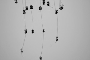
To start my ideas, I created a smaller version of what my installation would look like. I used transparent string to hang metal paper fasteners which would represent the stars in the galaxy, which construct the universe and also life. I liked how this set on a white background creates shadows and to develop this idea further, I would experiment with lights and also hang the ‘stars’ in a constellation shape to create a mystical feel.

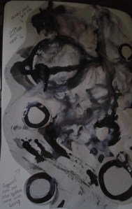
I then began developing my ideas with 2D experiments. This began with a simple ink drawing which I accidently spilled diluted acrylics over. I really liked this ‘milky way’ effect as I thought it looked quite mystical and peaceful. I liked the mood of this and also the added texture of the chalk dust which emphasised the space look.

Ink, diluted acrylics and chalk dust.

Ink, diluted acrylics and chalk dust.

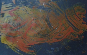
I then experimented with texture and colour, by using acrylic on acetate. I really liked the fiery look as it reminded me of the sun, which is a major part of the construction of our solar system. However, I wasn’t sure whether this portrayed the correct mood; I wanted my piece to be mystical.

Acrylic on acetate.

Acrylic on acetate.

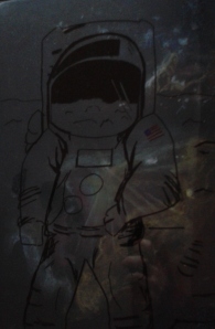
I liked the depth layering acetate on black created so I continued to experiment with this material. I also wanted to portray the connection between us and the universe. So I used a marker pen to draw an astronaut onto acetate and layer this over a chalk pastel drawing. Although I like the contrast between the bold, graphical marker pen and the soft pastel background and how it shows our interest with the universe, I wanted to show a deeper connection between the cosmos and ourselves.

Marker pen, acetate, chalk pastels and black card.

Marker pen, acetate, chalk pastels and black card.

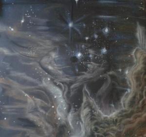
Finally, I found a link which would help portray the link between us and the cosmos. A lot of objects in the universe are of a circular shape, such as stars, planets, orbits etc. I decided to show the link between us and the universe by using the human eye in my piece. I feel that the intricate details in the eye relates well with the complexity of the universe.

My Fine Art final piece.  Chalk pastel on black card.

My Fine Art final piece.
Chalk pastel on black card.

I decided to use chalk pastel in my final piece as I liked the mystical, relaxed feel it created. The blended colours also create a soft look and the human eye in the centre really does blend into the landscape. I’m really happy with the effect created, as it looks surreal but also has a very real meaning behind it; space is a very complex construction which in turn contributed to the construction of life on Earth. The pupil in the centre could also represent a black hole found in the centre of galaxies, linking our life with space also as the pupil is in the centre of our eyes. Furthermore, black holes are also a source of destruction showing the circle of life; without destruction or ‘deconstruction’ in the universe, we would not have been constructed.

To develop my piece further, I would experiment with texture and maybe different materials to see how this would effect the mood.

I have learnt this week that before completing a final piece, a lot of experimentation should be completed as this helps develop your ideas and to improve your initial plans.

3D Designer, Jason Miller

Jason Miller’s ‘Endless’ L.E.D light system.

Better Homes and Gardens Decorating Book, 1975

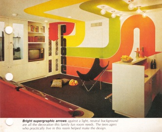
The influence on Miller’s Endless L.E.D lighting system can be seen from this 1970’s Supergraphics design which has inspirational flowing lines and aesthetically pleasing curves which guide your eyes around the room making the room appear larger and frames the space effectively.

This week I have been experimenting with 3 Dimensional Design, which lead to me researching various designers such as John Maeda, Max Lamb and Jason Miller. One piece of design I admired was Jason Miller’s ‘Endless L.E.D light system’. Jason Miller was inspired by 1970’s interior design trend Supergraphics. This inspiration is visible from the flowing lines which lead your eye around the room and the simple design which is used to frame the room.

Although Miller’s design is much more industrial looking than the Supergraphics design and is not brightly coloured, the Supergraphics design and Miller’s L.E.D lights serve an identical purpose; to frame a room and guide your eyes around the space, making the space look bigger.

I really like how Miller’s design can be upgraded by the consumer by adding extra lengths or curves, meaning that they can adjust it to their own living/business space and if their spaces change they can easily adjust the lighting system to fit the space. I also love how the lights can be suspended from the ceiling or walls with metal rods which look contemporary and don’t take a lot of attention away from the lights. Furthermore, I think that the lights would fit well in an urban living environment as they remind me of London tube maps with the curves and ‘endless’ lines.

Miller’s design has made me realise that simple design can be very effective and beautiful, whilst retro influences don’t necessarily mean colour or even 3D inspirations.

Endless

BHGDB75_supergraphics_arrows_phone

The Tate Modern Exhibit: Bill Viola, Tiny Deaths

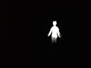
10253423_10201930996395846_1832551952_n[1]10705059_10201930996235842_646740866_n[1]10706397_10201930996275843_894129774_n[1]As the video comes to life alongside the sound effects, the imagery becomes clearer before suddenly disappearing in a flash.

As the video comes to life alongside the sound effects, the imagery becomes clearer before suddenly disappearing in a flash.

On the 18th of September I visited the Tate Modern, where one exhibit captured my attention. This was Bill Viola’s ‘Tiny Deaths’, 1993, which is located in the Poetry and Dreams gallery, level 2, room 9.  This was a piece of video art which used sounds and projections to capture the audience’s full attention. As you step into the darkened room, the sound of whispers fills your ears and grabs your attention. You feel a sense of thrill as the unexpected suddenly makes its’ self clear in the endless darkness; ghostly imagery suddenly appears, becoming brighter and clearer and disappearing as quickly as it had appeared. There was a series of these ghostly appearances which were all of different people and appeared at varied times, keeping the audience hooked to the unexpected.

I enjoyed visiting this exhibition as it kept your interest throughout and also allowed the audience to interact with the exhibit; the sudden ghostly imagery would make you jump in the complete darkness. The darkness combined with the sound effects made you forget about the other exhibits in the Tate and grabbed your full attention.

http://www.tate.org.uk/whats-on/tate-modern/display/bill-viola